




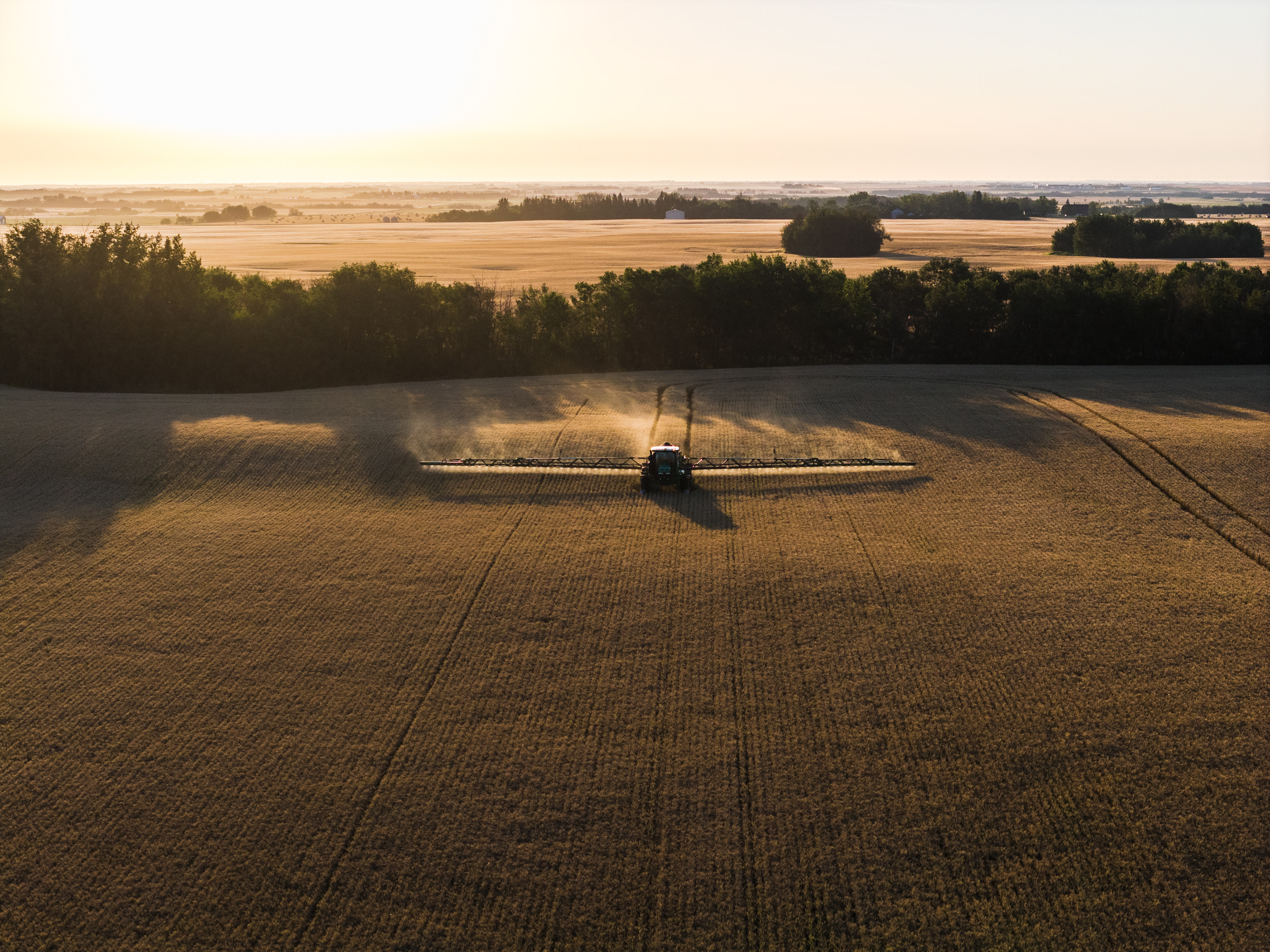
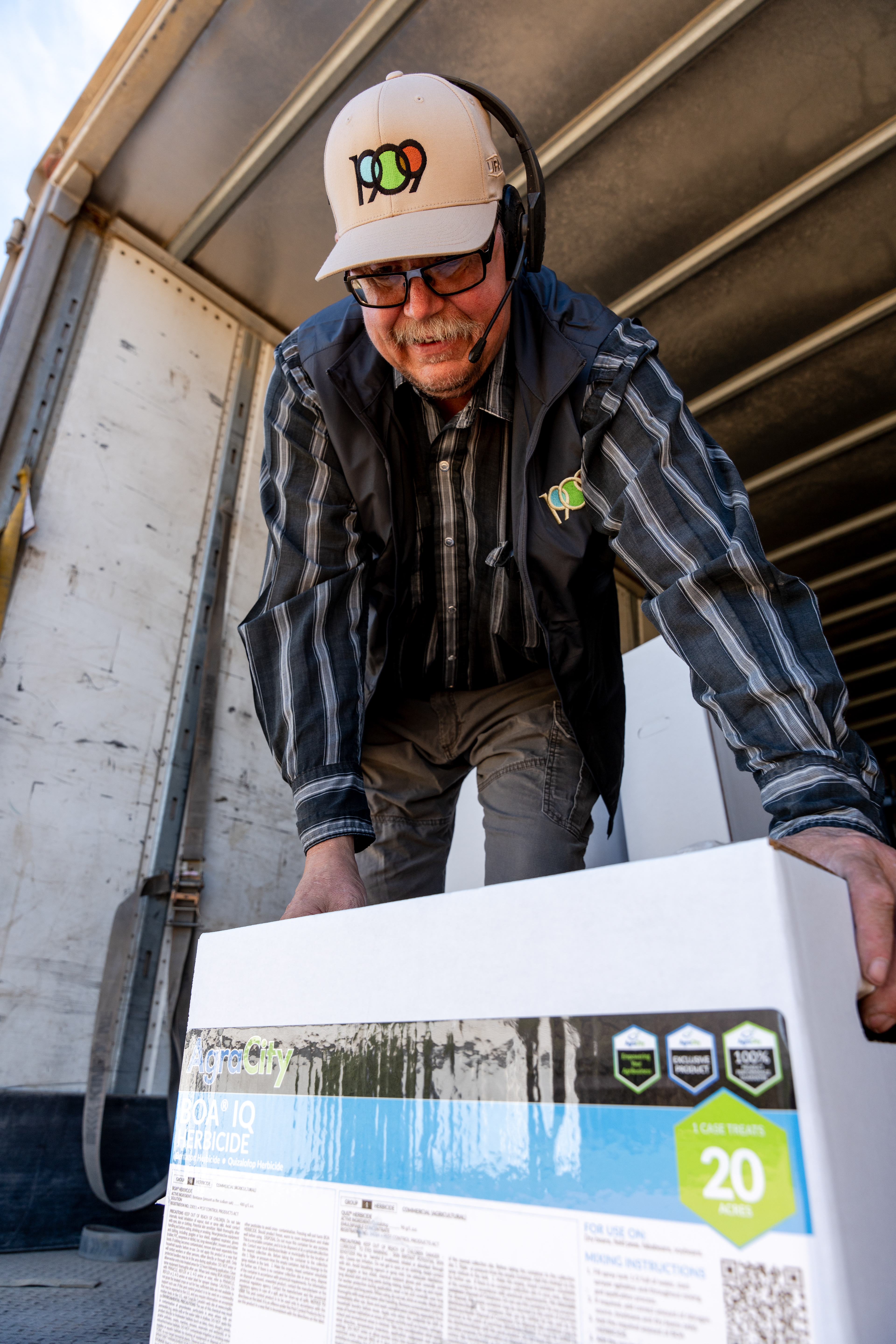


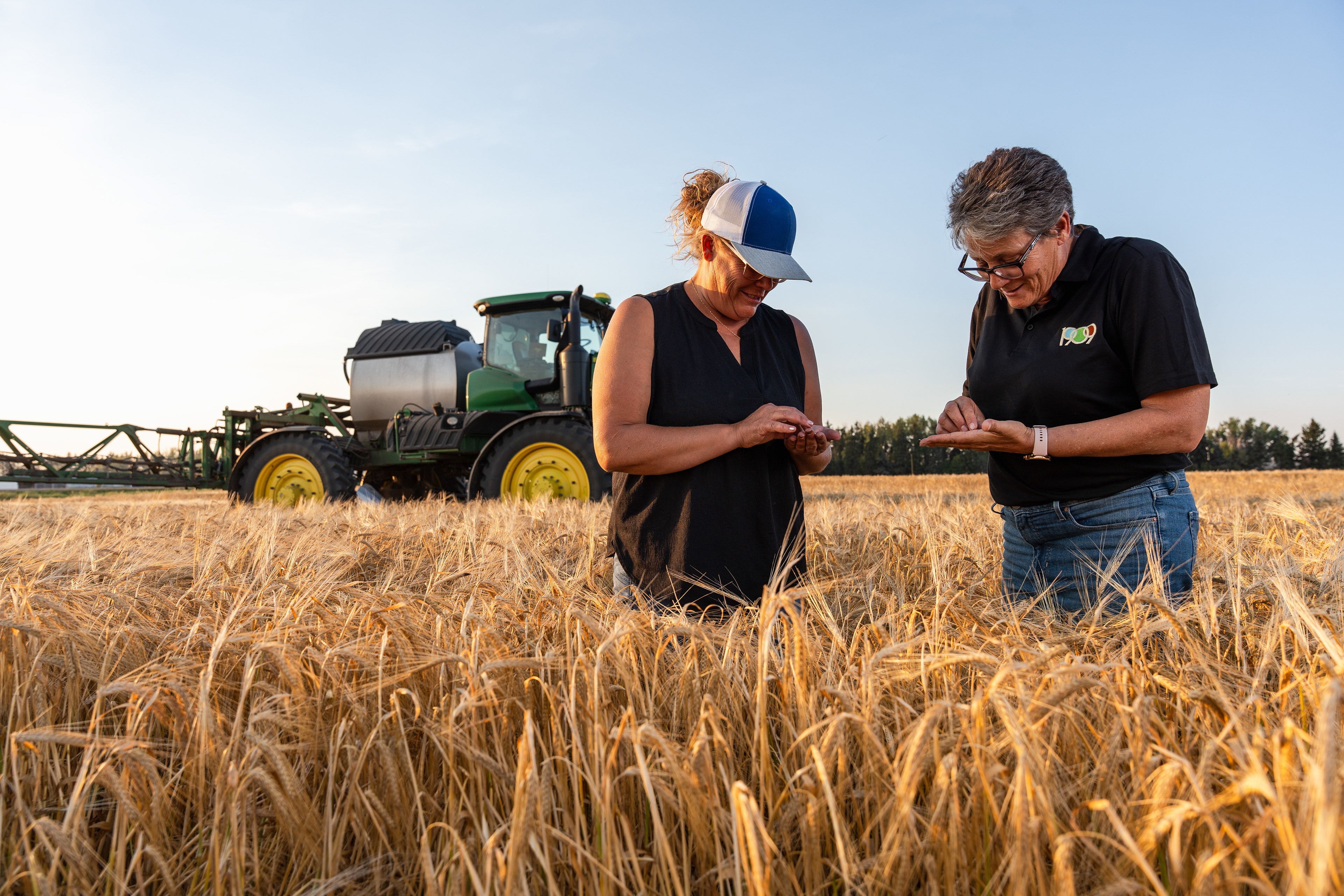

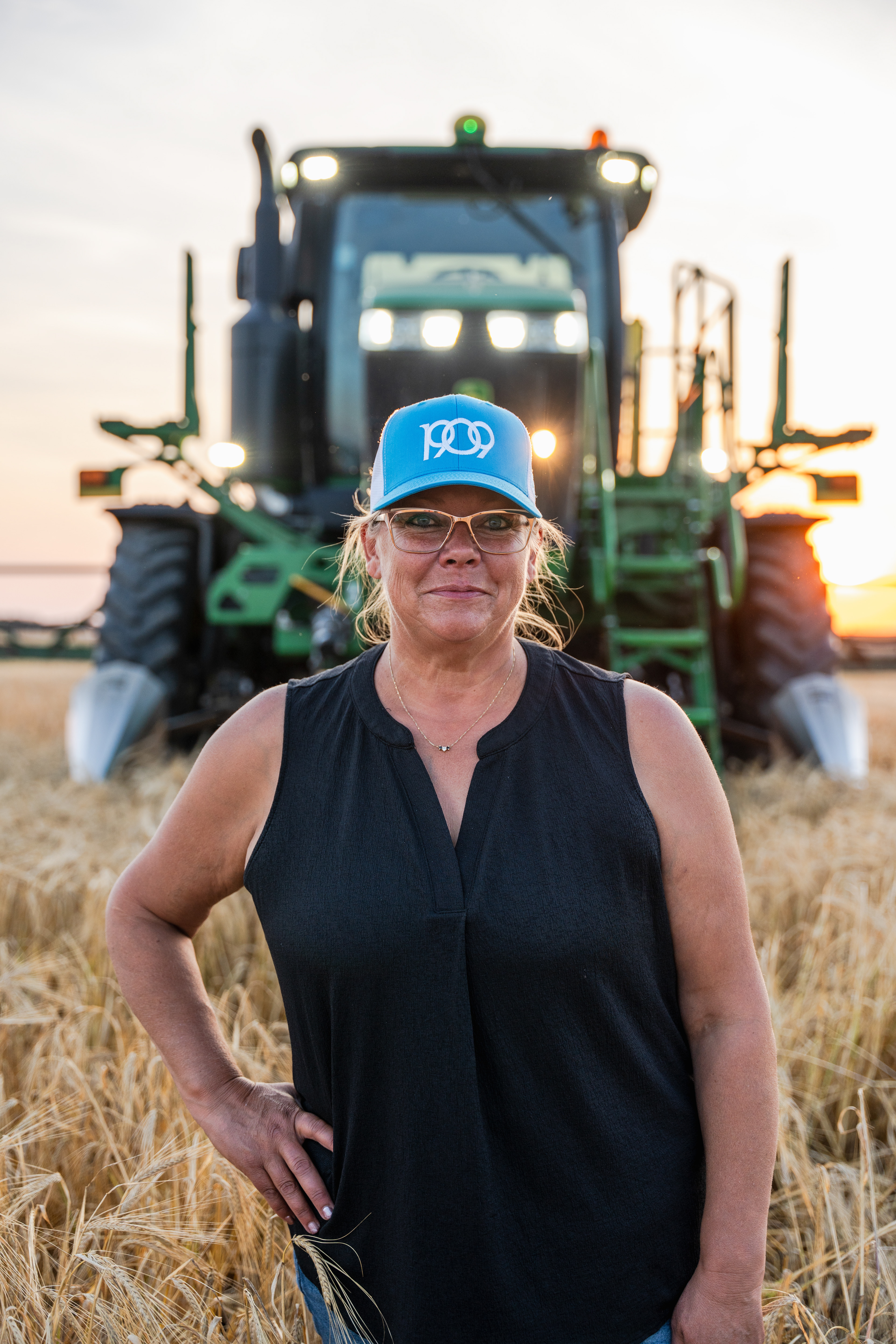
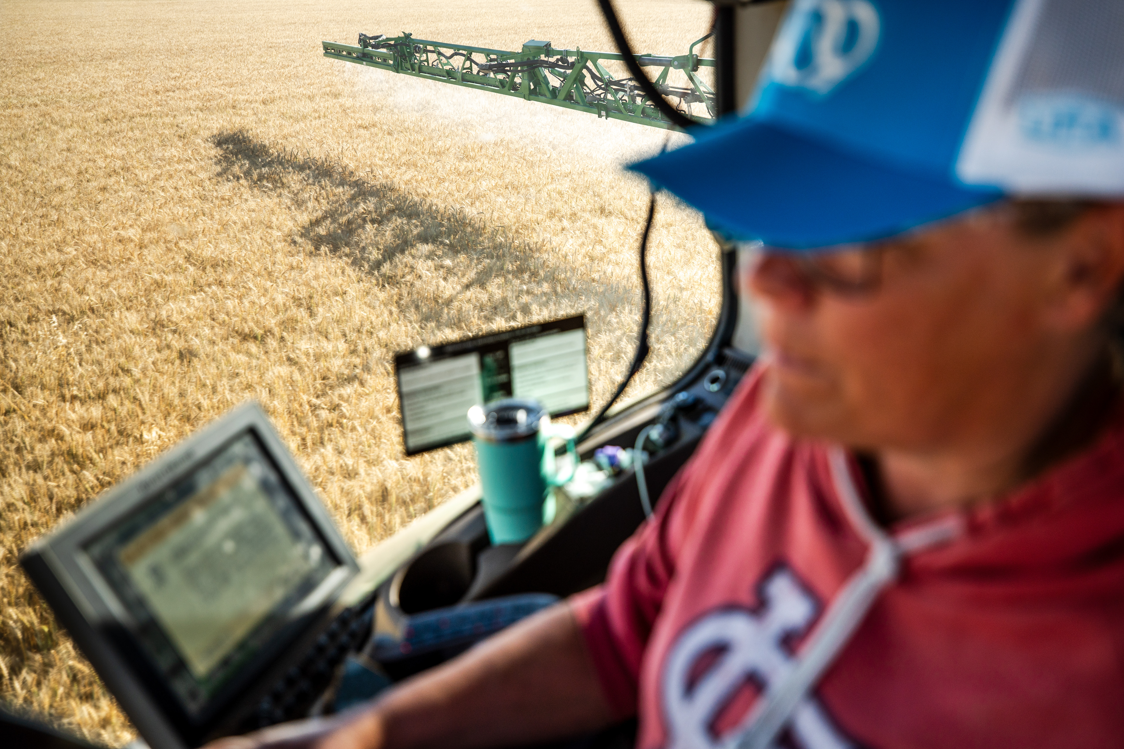
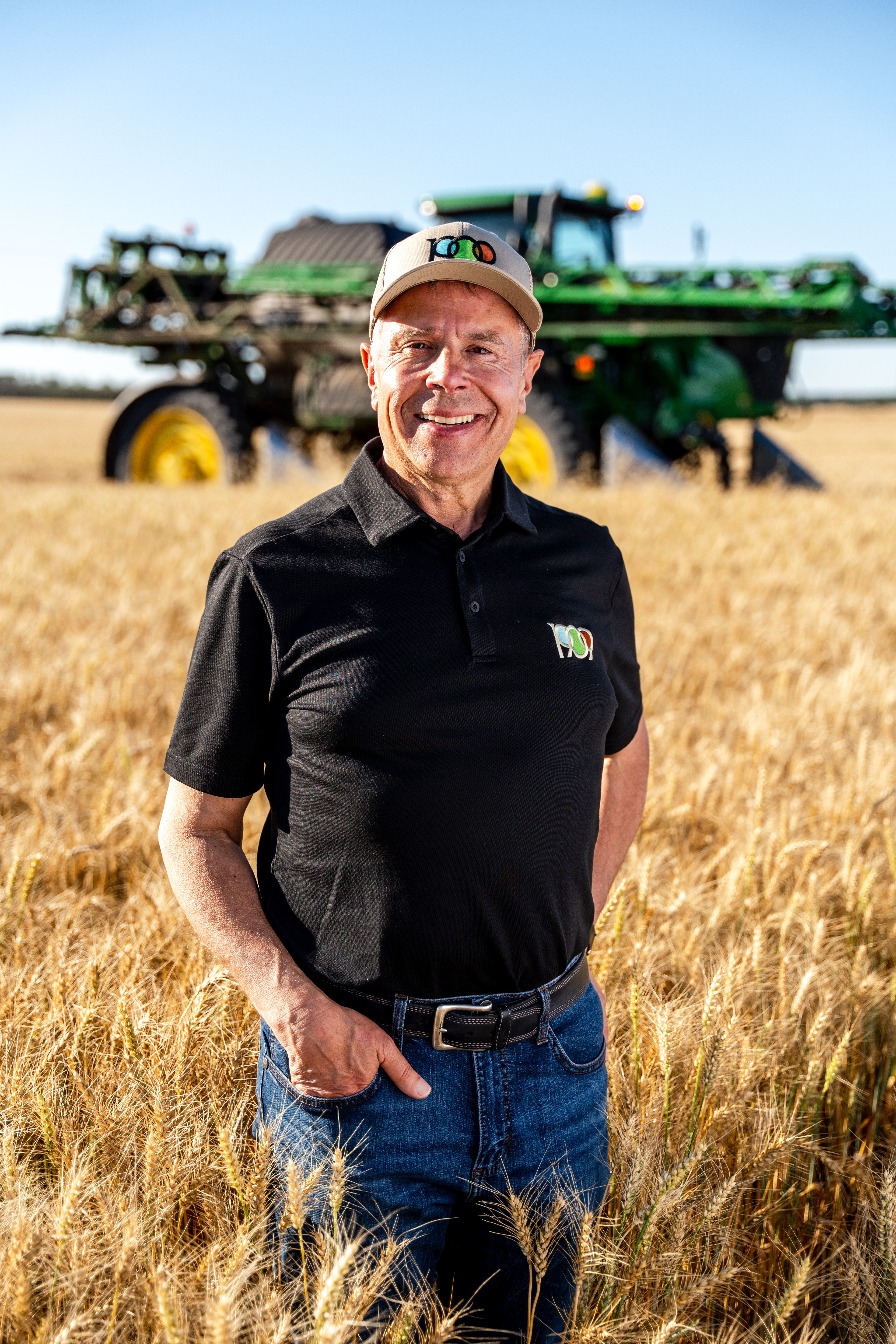
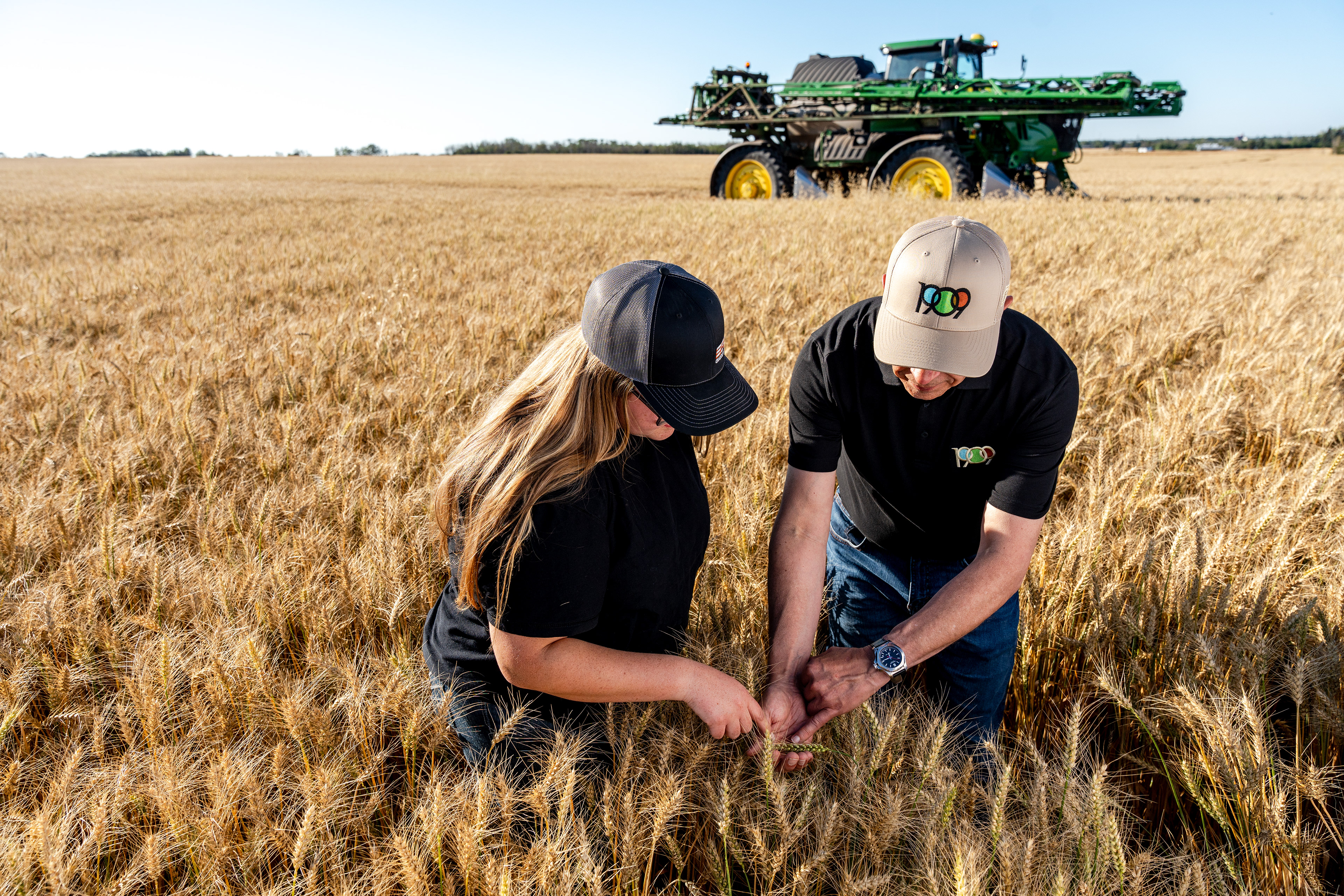


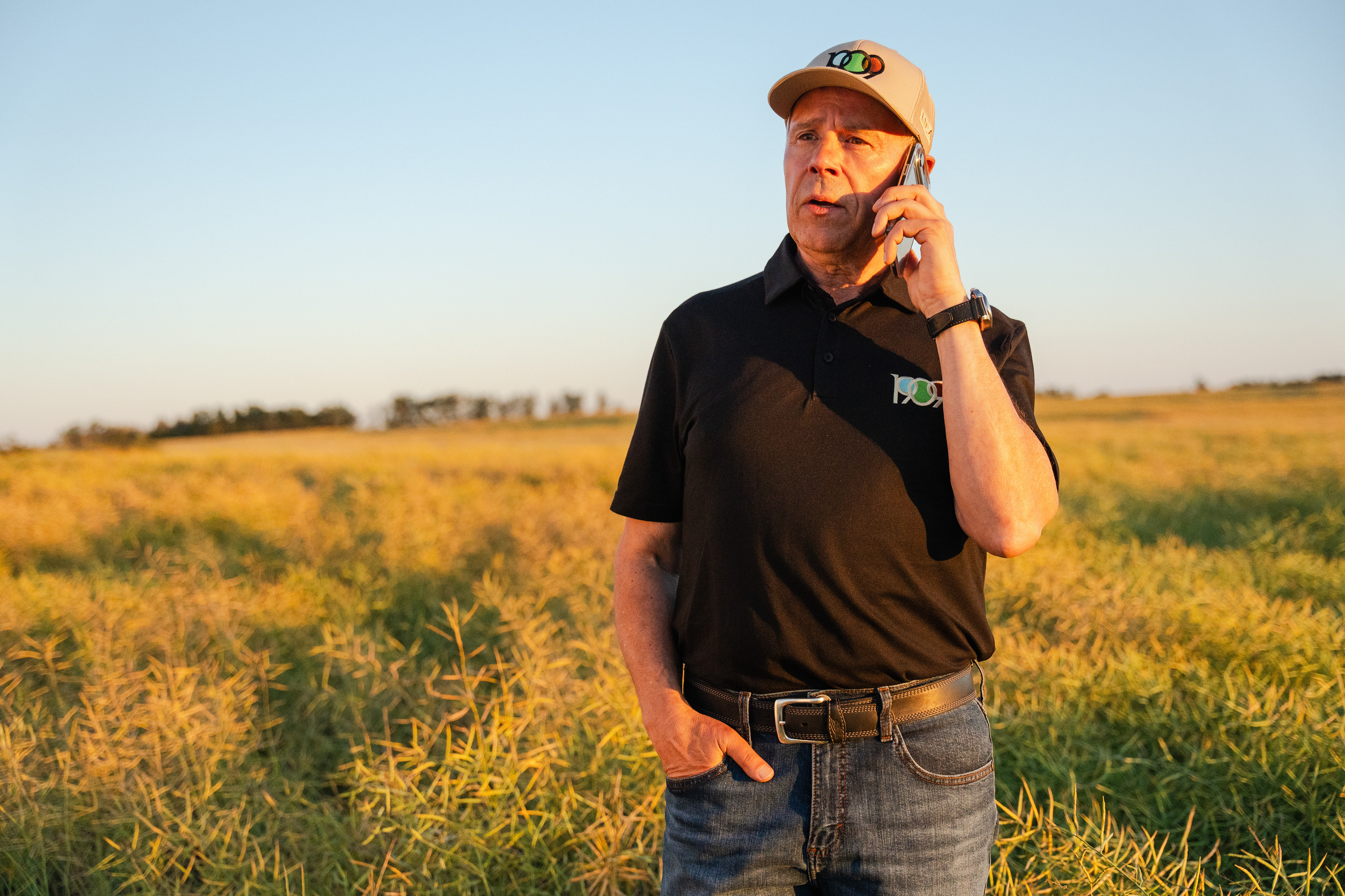

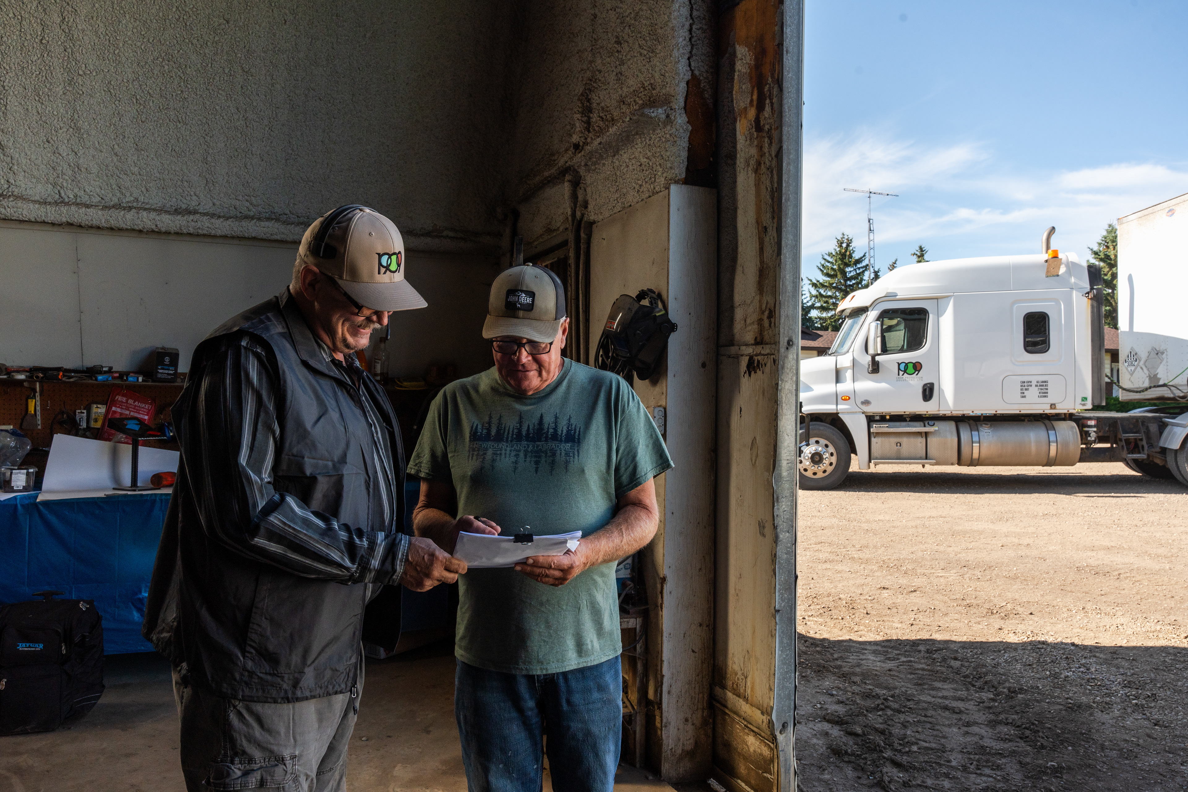
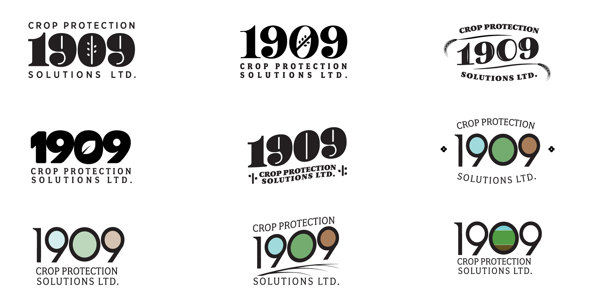


UFA acquired key assets of AgraCity and wanted to give it a fresh identity. Initially an ask to simply create a logo, this evolved gradually and unfolded into a cohesive brand kit for 1909 Crop Protection Solutions Ltd. An incredible opportunity to re-skin an already established crop input company (with the largest selection in Canada), this brand feels new and progressive, yet rooted in a history of a combined 135+ years. The logo and I.D. overall are filled with meaning, the colours representing the sky, crop and soil; all leading toward growth. The tones are bright, hopeful and stand out against competition. If you’re interested in the progression it took to get to the final logo, see the very bottom of the page.